Column charts sort the given hierarchies and measures into columns, with the hierarchy's member elements on the x-axis, and the measure on the y-axis. A column chart must contain at least one member hierarchy and one measure. Member hierarchies can be added to the Categories or Color drop zones, and measures to the values zone.
- On the ribbon, click the Components tab to see Chart Design.
Building a Column Chart
Before you begin
Create a new discovery from the User Hub, App Tabs, or on the right-click in the Content Explorer. As part of this process, you will need to open the appropriate Data Model for your analysis. For more information, see Access Discover Pro.
Step 1: Create your Basic Visual
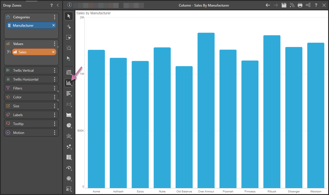
To set up the basic visual:
- Add the hierarchy that should be displayed on the x-axis of your column chart.
- Select Column Chart from the Toolbox (purple arrow below).
- Add the measure that should be displayed on the y-axis to the Values zone.
You can either drag the chip onto the visualization type on the canvas or double-click the dimension in the Dimensions panel.
Tip: You can right-click this option to view and select other submenu options.
Double-click or select the measure that you want to add in the Measures panel.
Step 2: Add More Hierarchies
Use the Color drop zone to add different measures and hierarchies to the query:
Color per Element
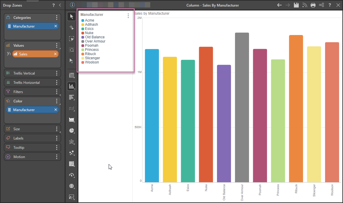
To add a color dimension to the query and create a Discreet Legend (purple highlight), you can move or copy the hierarchy from Categories to Color:
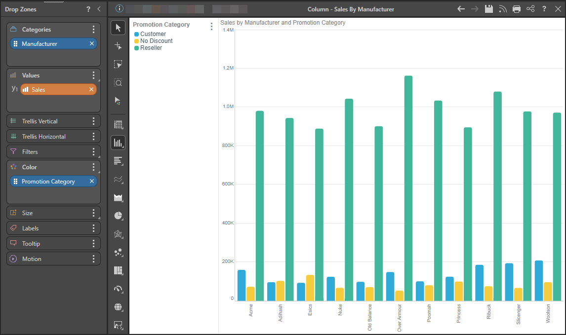
Add a Second Hierarchy
Alternatively, add a second hierarchy to Color:
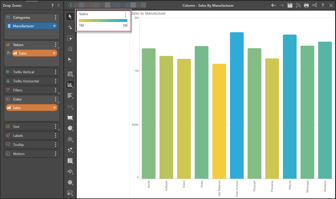
Copy the Measure to Color
Lastly, you can add a measure to Color. This may be the measure in the Values zone (as seen below) or a different measure. Note that a Continuous Legend is produced for this type of visual.